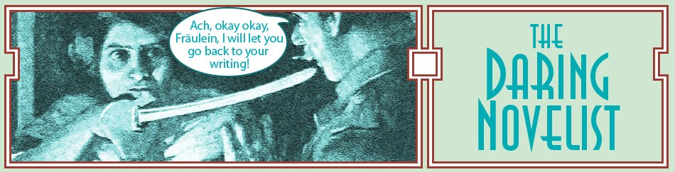

The figures were originally inspired by pulp illustrations. The smoking man was inspired by the logo for The Falcon And the thug was
inspired by every grotesque thug illo from comic and pulps you'll ever see.
 I think he was also subconsciously inspired by this book cover (which I think is an E. Phillips Oppenheim book but I can't remember just now). The colors are greatly enhanced here -- this is actually the impressed image illo from the actual cloth-bound book, not the printed paper dust cover. Images on the physical book are often simpler than the paper dust covers, with maybe one or two inks that easily wear off. Or no ink and just an embossed impression. The whole thing is often dull and low-contrast. The design on these things, therefore, has to be particularly good. Sort of like thumbnails -- it won't be seen clearly so it has to look fab anyway.
But that's only half of why I like my illustration from Episode 7.

One of the things these pulp illustrators often did really well was use the full depth of the setting. This particular example may not be the very best, because all the figures are pretty similar in size, and it's not a very deep setting. But often you'd see more exaggerated depth -- someone in extreme close up in the foreground, and someone or something seen over his shoulder in the background. The foreground figure would be almost a framing device for the background.
Now, in natural depth of field, you see either one or the other of figures so far apart in depth. One will be in focus, the other not. These artists put both in focus, emphasizing both figures. Often very dynamic and visually exciting.
Great filmmakers -- especially noir filmmakers after the war, through the 60's -- tended to use this sort of artsy style. (This is why the French came to worship the Noir film.) Of course, they had movement and time to add to it. The ending of The Third Man is a great example of using the deep background -- Valli walking toward the camera from far down the long tree-lined road, while Joseph Cotton waits for her in the foreground. In this case the power of the image comes from time and scale. (Imagine this seen on a big screen in a theater -- which is how I first saw it.)
Another video example that I can lay hands on quickly is the Peter Gunn TV show. It was a very very hip show at the time -- full of jazz. And though it was filmed at a time when all TV had low production values, it they used a lot of over the shoulder and depth of field to jazz up the impact. Often the openings were particularly stylish in terms of visual interest. Here's the opening of a show which uses a technique king of like that Third Man ending. A car comes down the road in the distance, as if it's going to pass right across, then turns to come right into extreme close up range, and continues past to head off into the background again as it enters a garage. Then a figure moves into the foreground, and sends a dog into the background. There's some close up work from another angle, but soon we return to that same camera, and see figures moving in and out -- using the background and foreground in the same shot.

However, when I look at the green cover up above, maybe I need to think about not representing location depth the same way -- but rather to put a stylized backdrop?
In the meantime, the serial continues with a complication for Plink, when MacGreevey decides to look into the case after all.
On Sunday there will be another post on the Plotting Game, with an explanation of the MOW 7-act plot structure -- then a week off while I play. These posts will be automatically posted and I will be away from my computer and may not see comments, or respond to them. (I'll try!)
See you in the funny papers.
No comments:
Post a Comment